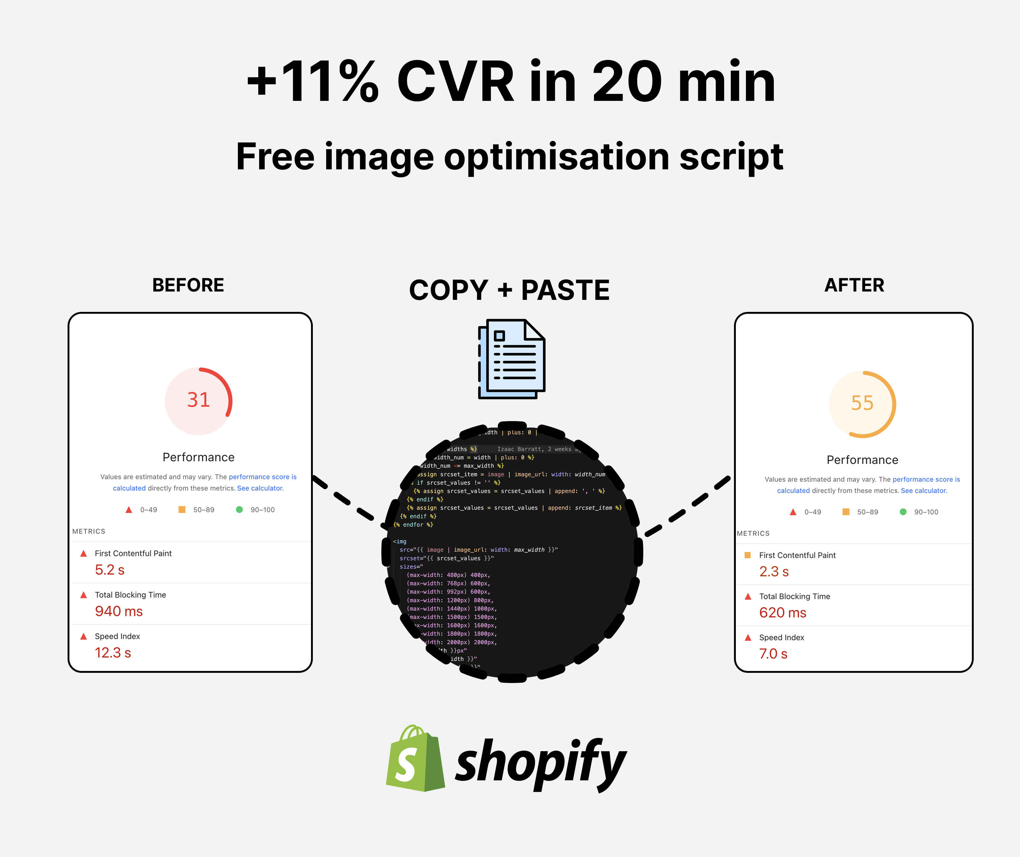
70% faster pages with preloading LCP
What is Preloading and Why It Matters for Your Store
Preloading tells your customer's browser to start downloading critical images before they're actually needed on the page. Without preloading, the browser discovers images as it builds the page, which creates a delay. With preloading, key images (like your hero banner) download in parallel with the rest of your page content, making everything feel faster.
Largest Contentful Paint (LCP) is Google's main metric for how fast your page appears to load. On most ecommerce sites, the hero image or carousel image is the largest element on the page, so it directly controls your LCP score. A faster LCP means better Google rankings and more customers who don't bounce before your page loads.
The improvement is simple: instead of your customers waiting for the page structure to load and then waiting for the image, the image starts downloading immediately. On average, you can improve LCP by 0.5–1.5 seconds just by preloading the first image.
Results
We used this exact snippet on a client store and decreased LCP load time 72%. This resulted in an +11% CVR lift, and an extra $71k in monthly revenue.
Where Your LCP Issue Comes From (And How to Identify It)
Most LCP problems on ecommerce sites come from carousels and hero banners - the large image at the top of your homepage or product page. Shopify's default image handling loads these after the page structure is built, which delays our main image.
To check your current LCP:
- Go to your homepage or product page in Google Chrome
- Open DevTools (right-click → Inspect or press F12)
- Go to the Lighthouse tab and click Analyze page load
- Under "Metrics," you'll see Largest Contentful Paint with a score (aim for under 2.5 seconds)
- Scroll down to see what element is causing the LCP delay. It's almost always an image
Once you've added the preloading code, run the test again and you should see a significant improvement.
Step 1: Create a Draft Theme
Before adding code to your live store, create a draft theme to test safely.
- Go to Shopify Admin → Sales Channels → Online Store → Themes
- Find your current live theme and click the dropdown menu (three dots)
- Select Duplicate and name it something like "Draft - LCP Optimization"
- Once created, click Edit code on your draft theme
Now you're working in a safe copy of your theme. Your customers won't see changes until you publish it.
Step 2: Add the Preloading Snippet
The code for preloading works best in your carousel or hero section.
- In the code editor, click Add a new snippet (or find your carousel/slideshow section file)
- Name it something descriptive like
image-preload.liquidif creating a new snippet, or edit your existing carousel section - Replace the image handling code with the snippet below
The code goes inside the loop that generates your carousel images. If you're editing an existing section, find where images are currently being rendered and replace that section with this code.
The Complete Code Snippet
{% for block in section.blocks %}
  {% assign preload = false %}
  {% assign loading = 'lazy' %}
  {% assign priority = 'auto' %}

  {% if forloop.first %}
    {% assign preload = true %}
    {% assign loading = 'eager' %}
    {% assign priority = 'high' %}
  {% endif %}

  {{
    block.settings.mobile_image
    | image_url: width: 1000
    | preload_tag: as: 'image', loading: loading, fetchpriority: priority, media: '(max-width: 769px)'
  }}
  <picture class="slideshow-image-wrapper">
    {% if block.settings.mobile_image %}
      {{
        block.settings.mobile_image
        | image_url: width: 800
        | preload_tag:
          as: 'image',
          loading: loading,
          fetchpriority: priority,
          media: '(max-width: 768px) and (min-width: 480px)'
      }}
      {{
        block.settings.mobile_image
        | image_url: width: 400
        | preload_tag: as: 'image', loading: loading, fetchpriority: priority, media: '(max-width: 480px)'
      }}
      {% capture mobile_srcset %}
        {{ block.settings.mobile_image | image_url: width: 200 }} 200w,
        {{ block.settings.mobile_image | image_url: width: 400 }} 400w,
        {{ block.settings.mobile_image | image_url: width: 600 }} 600w,
        {{ block.settings.mobile_image | image_url: width: 800 }} 800w,
      {% endcapture %}
      <source
        media="(max-width: 768px)"
        src="{{ block.settings.mobile_image | image_url: width: 800 }}"
        loading="{{loading}}"
        fetchpriority="{{priority}}"
        srcset="{{ mobile_srcset }}"
        sizes="33vw"
      >
    {% endif %}
    {{
      block.settings.image
      | image_url: width: 2000
      | image_tag: class: 'slideshow-desktop-image', alt: block.settings.image.alt
      | default: shop.name,
        loading: loading,
        fetchpriority: priority,
        preload: preload,
        sizes: '100vw',
        widths: '100,200,300,400,600,800,1000,1200,1500,2000,2400'
    }}
  </picture>
{% endfor %}
How This Code Works (Broken Down)
The code is organized into three main parts:
Part 1: Set Up Priority for the First Image
{% if forloop.first %}
  {% assign preload = true %}
  {% assign loading = 'eager' %}
  {% assign priority = 'high' %}
{% endif %}
This says: "Only for the first image in the carousel, tell the browser this is critical." The first image always appears when customers land on the page, so it needs priority. All other carousel images stay hidden until users interact with the carousel, so they can load slowly in the background.
Part 2: Preload the Correct Mobile Image Size
{{
  block.settings.mobile_image
  | image_url: width: 1000
  | preload_tag: as: 'image', loading: loading, fetchpriority: priority, media: '(max-width: 769px)'
}}
This tells Shopify: "Start downloading the mobile version of this image immediately, but only for screens smaller than 769px." The preload_tag is Shopify's built-in tool that adds preloading to your page's HTML head. By specifying media conditions, you only preload the image size customers actually need.
Part 3: Serve the Right Image Based on Screen Size
<picture class="slideshow-image-wrapper">
  <source media="(max-width: 768px)" ... >
  <!-- Image tag for desktop -->
</picture>
The <picture> element is HTML's way of saying "show different images for different screen sizes." On mobile, browsers show the optimized mobile image. On desktop, they show the desktop version. This ensures every customer downloads the smallest file size for their device. Otherwise we have to download both images but hide one.
Why We Use Specific Image Widths
Notice the widths: '100,200,300,400,600,800,1000,1200,1500,2000,2400' line. These are the exact sizes Shopify will generate for your image. By offering options, you let the customer's browser pick the closest size to their screen width, avoiding oversized downloads. For example, a tablet user on 768px width won't download a 2400px version of the image.
Why Lazy Load Other Images
All images after the first one have loading: 'lazy' and fetchpriority: 'auto'. This means they only start downloading when a customer gets close to scrolling to them. This frees up bandwidth for the first critical image.
Test Your Changes: Before vs. After
Now you'll compare your page speed with and without the preloading.
Step 1: Test Your Draft Theme
- In your draft theme code editor, click View to open the draft in a new browser tab
- Scroll to your hero/carousel section to make sure images still display correctly
- If something looks wrong, the code may need adjustment for your specific theme structure
Step 2: Run Google PageSpeed Insights on the Draft
- Copy the URL of your draft theme (make sure you select it using the Preview Bar at the bottom of the page)
- Go to Google PageSpeed Insights
- Paste the URL and click Analyze
- Note the LCP score and the specific LCP time in milliseconds (you'll see "Largest Contentful Paint" under Metrics)
- Take a screenshot for comparison
Step 3: Test Your Original Theme
- Open your current live site in a new tab
- Go back to PageSpeed Insights, paste your live URL, and analyze
- Compare the LCP scores
You should see your draft theme's LCP score drop by 0.5–1.5 seconds. If the improvement is significant, you're ready to publish. If not, double-check that the code is placed in the right section of your theme.
Step 4: Publish Your Draft Theme
Once you're satisfied with the results:
- Go back to Shopify Admin → Themes
- Find your draft theme and click the dropdown menu
- Click Publish to make it your live theme
Your faster pages are now live, and your customers will experience better performance immediately. You should also see improvements in your Google Search Console rankings over the next few weeks, as page speed is a ranking factor.
Common Issues and Solutions
If your images don't appear or the carousel looks broken after adding this code, the issue is usually that your theme's image settings are different from what this code expects. Check that your theme section has settings for block.settings.image and block.settings.mobile_image. If your theme uses different names (like block.settings.hero_image), replace them throughout the code to match your theme.
If you don't see much LCP improvement, verify that the images you're preloading are actually the element causing your LCP in PageSpeed Insights. Sometimes text or other content is the LCP, not images. You can always run another Lighthouse report to confirm.